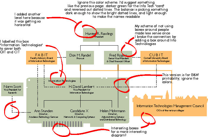
Here are some notes. As I say below, these colors are for easy printing off the web..and I still have my doubts. This really should be viewed with a browser. The type looks pretty sharp when printed at 600 dpi ...but this looks funky on my screen. Consider this another organizational pass. DRAFT FOUR is the version I like best at the moment.